Hey there 👋 we’re back with another CRO & PROFITS NEWSLETTER. Bringing real actionable value to brand owner to drive a higher revenue and bottomline profit for your brand.
If you’re a founder, a marketer, or anyone that gives a sh*t about conversions, you’ve probably been here:
You spend weeks (or drop $6k+) designing a beautiful product page without any research, or even if you did it’s not doing anything for your metrics.
It looks sick.
Great photography. Fancy fonts. Every section polished.
And then… it flops.
We’ve seen this exact thing happen across 90% of the brands we’ve audited.
Here’s why it happens:
Most product pages are TRASH.
Just a nice layout to show off your product.
But the product page isn’t meant to just show.
It’s there to sell, educate & handle pre purchase concerns and questions.
It needs to answer doubts, overcome objections, and guide a cold visitor toward making a decision.
So here’s a battle-tested framework we use across every single brand we work with. It’s not about design. It’s about psychology.
👇 Above the Fold: Where 90% of Conversions Are Won or Lost
This is the first 2–3 scrolls on mobile.
If your page doesn’t do its job here, the rest doesn’t matter.
You need absolute clarity.
Here’s what works:
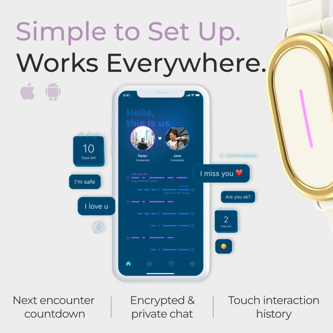
Your product images aren’t just there to be showing a simple product in a white background.
They’re sales assets, and most brands sleep on them, putting zero effort into it.
Here’s what we push on every PDP we touch:
1. Let’s call it what it is: Most PDP product images are visual fluff.
They look clean. They might even be on-brand.
But they don’t sell.
At PM Digital, we treat every product image as mini-CRO in disguise. It should:
Kill pre-purchase objections
Show the product’s real-world benefit
Build instant trust
Use psychological cues to move people closer to the “Add to Cart”
This isn’t just “design.”
It’s sales psychology, visual persuasion, and strategic messaging all working together.


Product image checklist -
✅ Product is visually dominant
✅ Each image communicates one clear message
✅ High text contrast (readable on mobile)
✅ Font hierarchy and legibility are crisp
✅ Icons simplify, not clutter
✅ Balance of emotional + logical triggers
✅ Every slide either:
Builds trust
Handles a concern
Explains usage
Increases desire
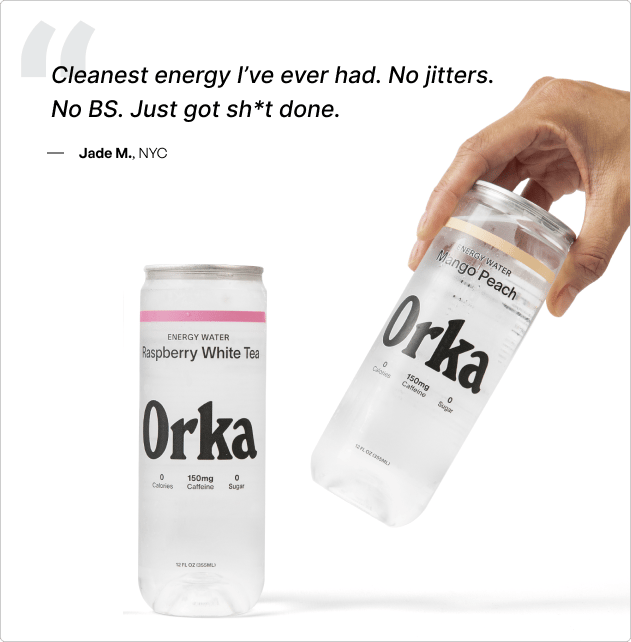
2. 💬 Reviews. Not Just Proof, But Objection Killers
Stop burying your best sales copy in the reviews section.
Here’s how to make reviews work hard for conversions:
Feature 1–2 killer reviews above the fold
Especially ones that handle doubts:
“I have eczema and this didn’t irritate my skin.”
“Was skeptical but after 3 uses I noticed a difference.”
“Actually cheaper than my old product over time.”
Put those above the CTA or right under the price.
Use quotation marks, star ratings, and a small customer name/photo if possible.
Pin reviews that match the common objections
This is why exit surveys, customer interviews and CS tickets matter.
If people are worried about shipping, safety, size, scent, taste, etc.
You should have reviews pinned that say:
“Smells amazing — not overpowering like I expected.”
“I was worried about shipping time, but it arrived in 2 days.”

That’s 10x more convincing than your FAQ.
3. ✅ USPs & Outcome-Driven Copy. The Top Section Is the Hook.
Let’s be honest, no one reads a list of “Features.”
They want to know what it does for them.
Here’s how to do it right:
🔹 Don’t say: “500mg Magnesium Bisglycinate”
🔹 Say: “Wake up fresh. Fall asleep faster. Zero grogginess.”
Make your top section copy pass this test:
“What do I actually get from this?”
Try this structure:
Outcome line (energy, better skin, deeper sleep)
Mechanism (how it does it)
Social proof/validation (trusted by 30,000+ women)
And yes, use icons.
🎁 Offers, Quantity Selectors, and Shipping Thresholds. All Must Be Congruent.
Most brands offer free shipping over $50.
Then position a hero product at $38.
Why?
Either raise the threshold and the AOV, or bundle the product with an easy quantity selector.
How to Nudge Up AOV Without Forcing It
1 bottle: $30
2 bottles: $56
3 bottles: $70 $65 + Free Shipping
→ Now the 3-pack looks like the best value, and they unlock free shipping.
You’re not discounting. You’re positioning.
Tip: Show the math visually, don’t make the customer work it out.

Example of an offer section

🔁 Subscription Widgets. Don’t Just Add One. Justify It.
Most subscription toggles are passive.
Just a little switch saying “Subscribe & Save 10%.”
That won’t move volume.
Instead:
Visually break down the value:
“Delivered monthly. Cancel anytime.”
“Save £4 per order + get free shipping.”
“Early access to drops + priority support.”
Use badges, icons, or even mini benefit bullets.
And always show how much they save over 3/6 months, show lifetime value, not just % off.
Example copy:
“Subscribe and save £48 a year. Never run out. Cancel anytime.”
Now it feels like a smart choice, not a commitment.

🔽 Dropdowns Below CTA - Use These to Handle Real Buying Questions
We treat these like micro FAQs.
Most brands just fill them with generic filler. Here’s what yours should actually cover (based on research, not guesswork):
🔸 What goes inside:
“How long does it last?”
“Does this work for [sensitive skin / allergies / pets / etc.]?”
“Can I combine this with other products?”
🔸 Where to find the answers:
Get these from:
Exit surveys on PDPs
Support tickets
Review patterns (words customers use repeatedly)
Winning ad comments
Customer interviews
Then write short, punchy answers.
Don’t fluff. Don’t ramble.
This is your reassurance layer before they hit “Add to Cart.”
TL;DR
Here’s the cold traffic checklist we apply to every PDP we optimize:
✅ Show the transformation in your images
✅ Use reviews to kill doubts, not just to show love
✅ Lead with outcomes, not ingredients
✅ Structure pricing to nudge up AOV, not stall it
✅ Sell the subscription with actual benefits
✅ Use dropdowns to answer questions you already know they have
At PM Digital, we don’t chase vanity wins. We optimise your entire funnel as your all-in-one Shopify & CRO Agency.
We dive deep into customer behavior, audit your sales funnel, and build A/B tests that actually grow profit, not just clicks.
Let’s optimize smarter, not harder.
P.S.
Every day you run random tests, you risk making your funnel worse.
Let’s fix that—before your next “win” becomes your biggest loss.
THE END. WE HOPE YOU CAN TAKE SOMETHING FROM ANOTHER CRO & PROFITS NEWSLETTER. Hypothesis, Test, Learn, Repeat. Keep it profitable. Let's crush the remaining of 2025 🚀 If you’re ready to trade in surface-level tweaks for serious growth, let’s chat. 👉 Reply to this email or click here to book your CRO strategy session. |


